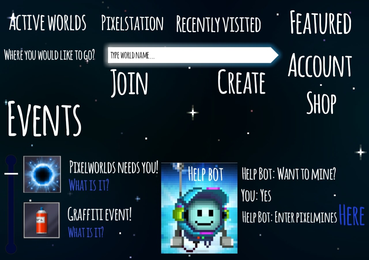
Hello guys! Some of you maybe know that Jake said in yesterday’s stream that whole developement agree making New main menu but when they could make it they didnt know…
Soo i decided to make idea how it could look like in future:
I really hope u like it because i put lot work into it.
Btw i hope its not messy, i tried my best.
I give all the right of my feature design to Kukouri Mobile Entertainment Itd. to use it as they please in their games/social media or in any other form of media.
Also I don’t understand the purpose of that bot saying “watch active fishing worlds”, I don’t think fishing worlds deserve to take a quarter of the main menu. And the text doesn’t resemble buttons, it just looks like random text spew around the screen.
If that gets added, then I’ll be confused on what button to choose so.
Let the developers make this, or just what if. they might add something below the join and create button. We shall find out soon.
I mean, I like the drawing you did try. But if this was already in game with its original letters, buttons and features then it’s messed up. I will wait for it. Don’t force yourself!
Uh dude i posted this to see what community think and thank’s to u i realised its messy, Im tring to make it better, in my opinion its just a suggestion not supposed to be main menu in future if developement dont want this…
Personally, I think it’s too complicated. The one we have at the moment fulfils most of what it needs to, and the layout is effective, and easy to navigate. (Plus, it’s consistent with other UI in the game)