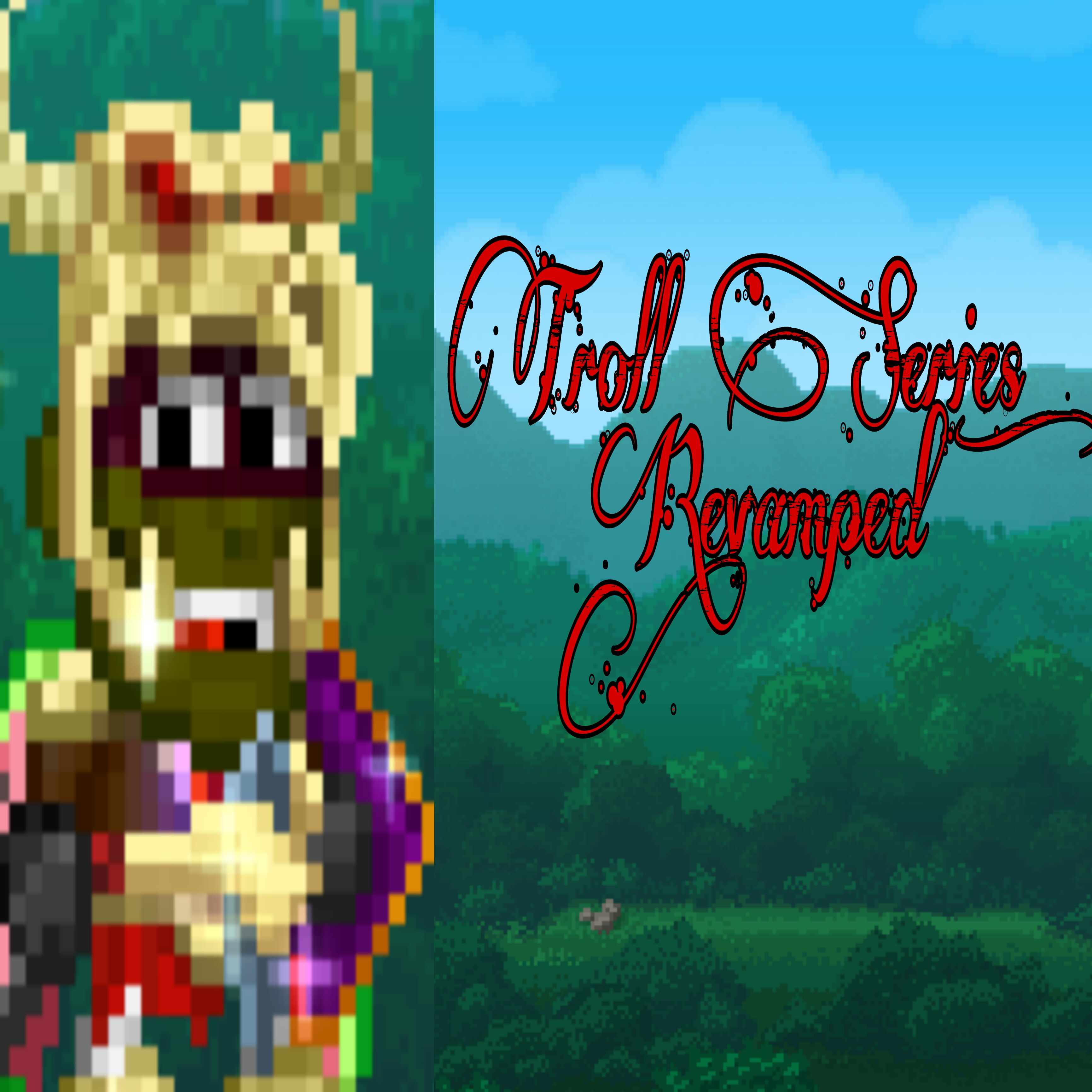
It is very…streched  good attempt
picsart isnt the best for thumbnail material ^^"
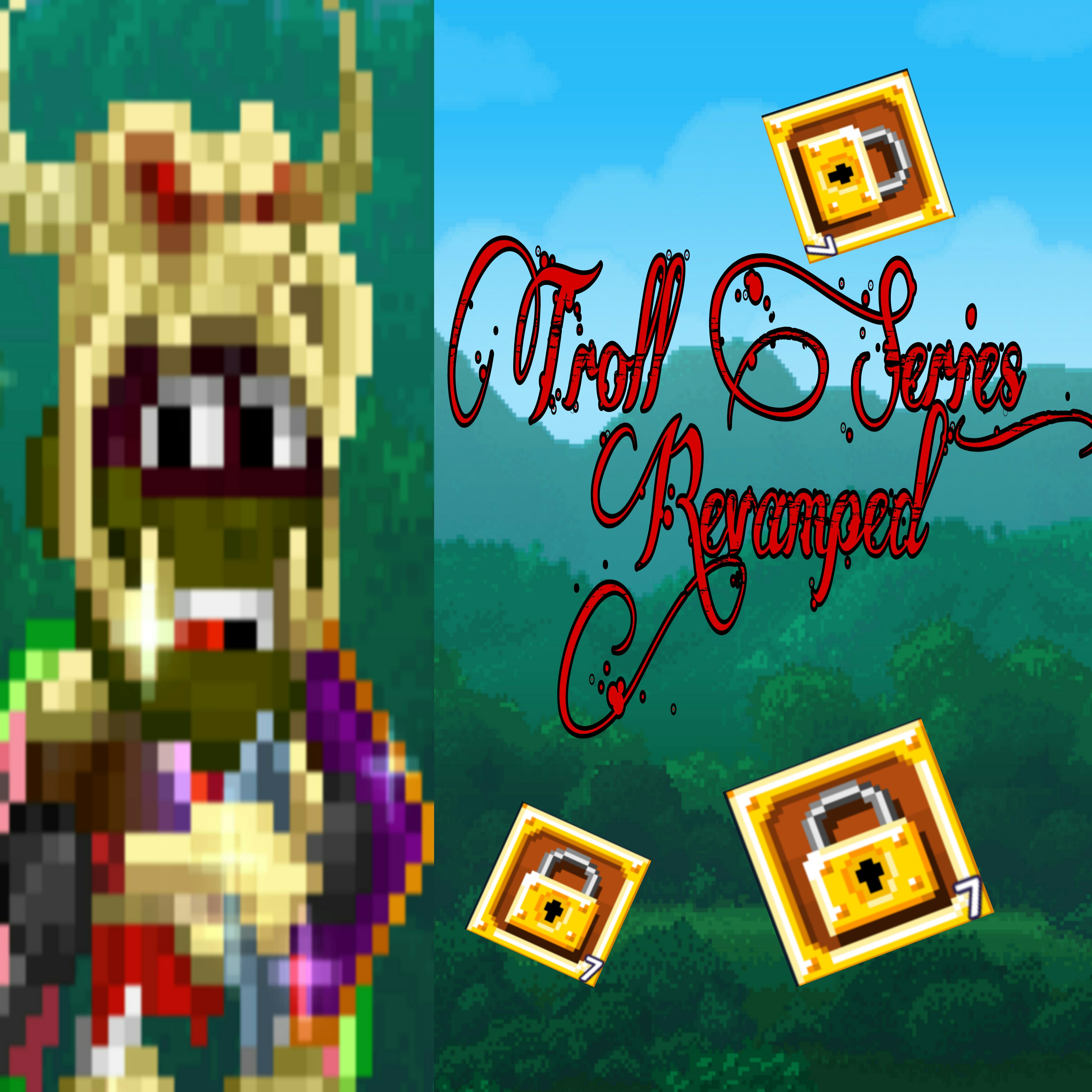
Add a couple of random world locks 
your right it wont grab views otherwise xD
Try a different font, something more simple or pixel-y. Then add the important piece of the thumbnail to the center (example: the character, wls, prizes)
i never really made my own thumbnails before.
Rather use the normal PNG
Bro that is actually better but I think you could maybe remove the guy on the left
And as not so dark said make the writing more readable
do you know how to add it?
No i don’t lol I’m just saying what would look nicer in my opinion
idk about the quality and how its very high but its a good attept next try using a free photoshop kinda thing there are many out there on the internet
I would recommend you to check out video tutorials, Wide putin style but in pw. (In a good way)
Do Ft Jake 10000000% give more views and put him in too(but not in the vid)
Took a minute of my time to make it the correct aspect ratio.
I didn’t change anything about the design since I have no idea where to start but please at least don’t make it stretched.
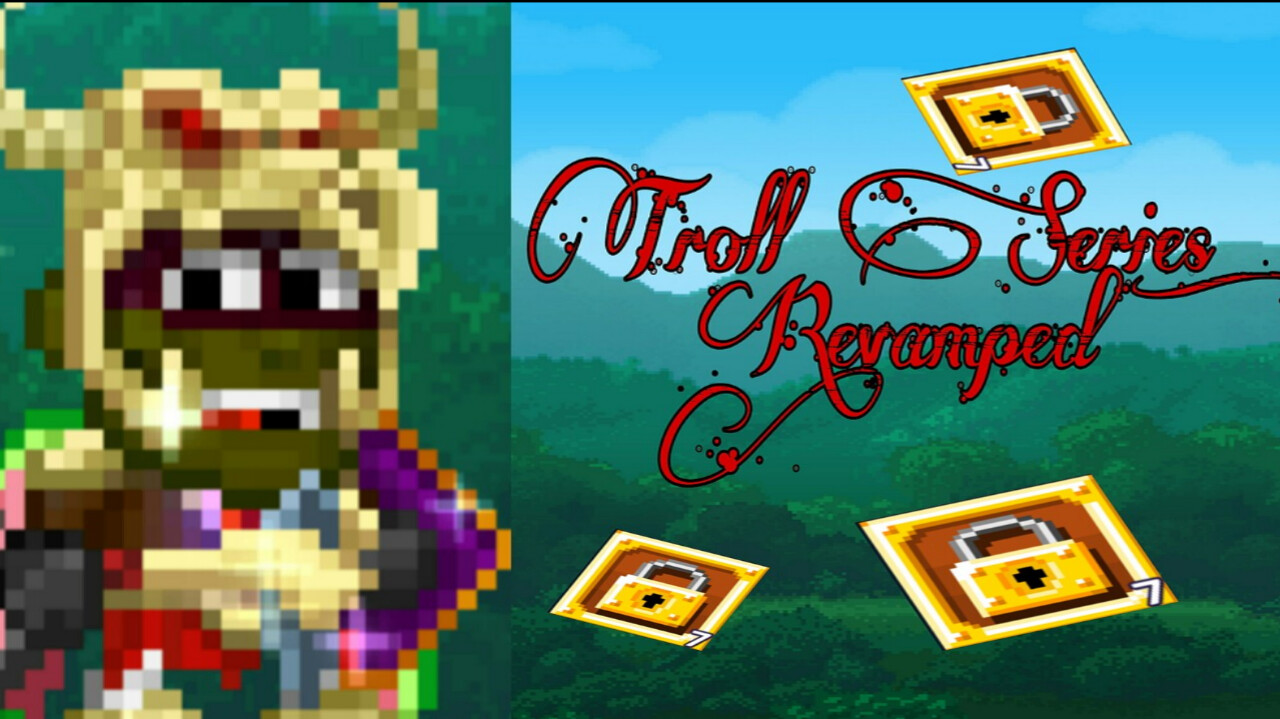
Took a bit more than a minute of my time and made this:
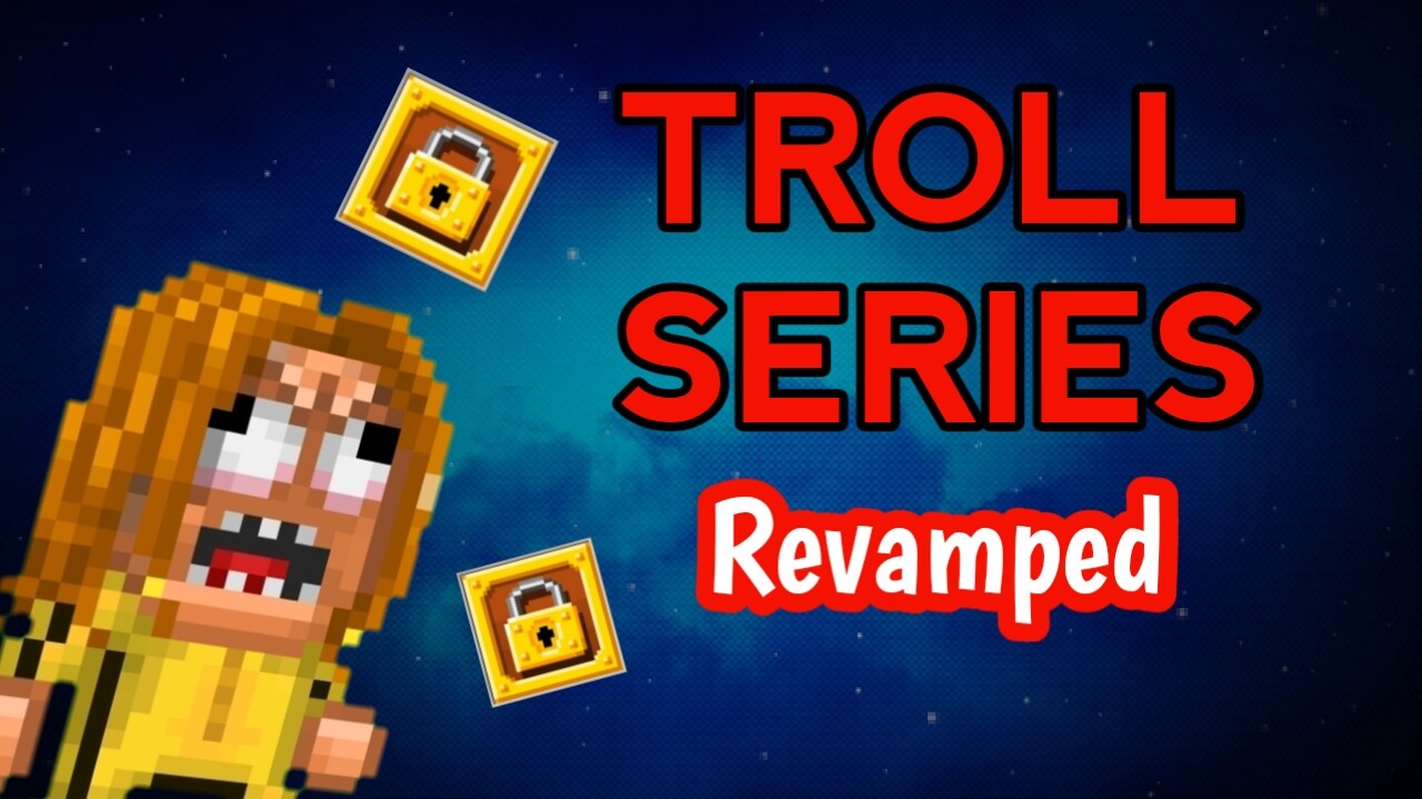
It’s still not a really good thumbnail, since different people like different thumbnails, but at least you understand what the text says.
Anything that catches the eye of the viewer and of course not clickbait such as these.
Keep it simple and ofcourse keep the resolution to a solid 1280x720 and you should be good!
P.S- Adding a couple wls or pls is a nice touch
Here’s a small edit that you can get inspiration from of a sense of how I do it.
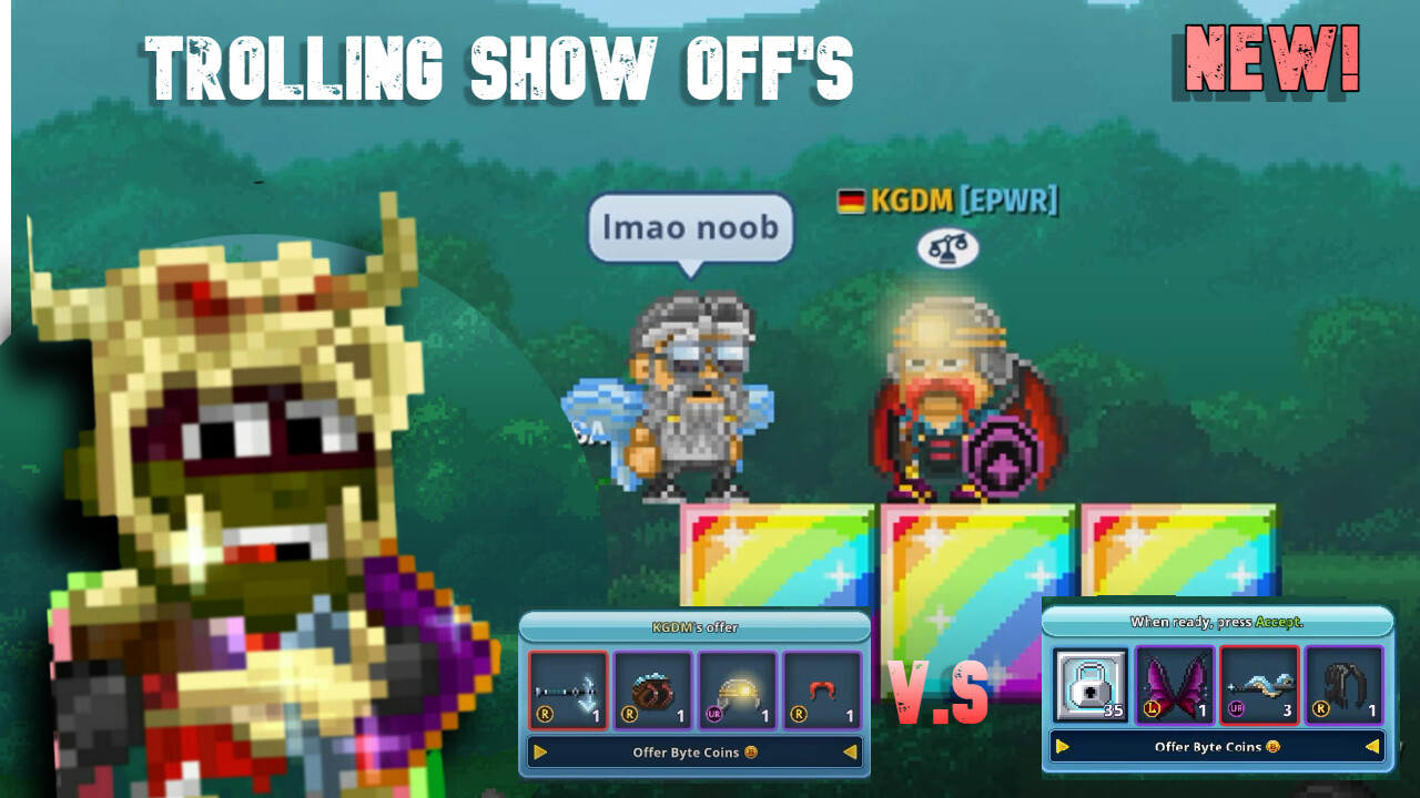
P.S The dude was targeting noobs and kept saying “HAHAHAHAH NOOB” so showed him 