Gimme ideas

Im working on a game, a turn based battle game, and i run out of IDEASSS

gimme ideas if u have
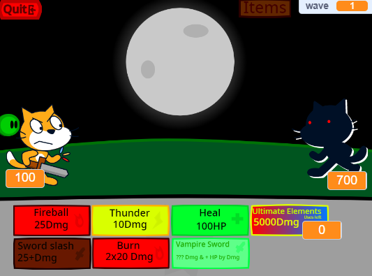
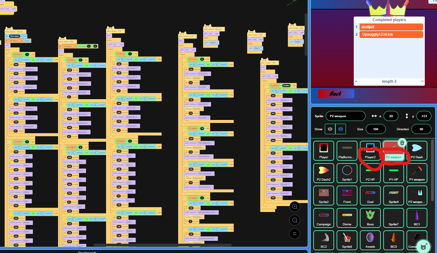
picture of game

image
i know this looks bad (not really), this was made in scratch tho

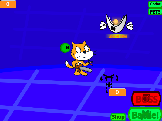
The game main menu if you want to see it

image
that thing next to the cat = sprout which gives some things
that thing next to the cat flying = special offers
that thing at the upper left = Cash from battles
That “Pets” Button = change your pets
That “codes” button = more like gift code thingy
if you want me to add anything in the menu, or maybe redesign those things, go ahead say it, i need ideas

this doesn’t count as advertising right?

7 Likes

That looks pretty good keep up the work.

Mqybe you could add a way for your character to block or jump over incoming damages.

Hmmm enhance the user interface by adding some textures. And also change the fonts.

1 Like

Add jake in the game :slight_smile:

1 Like

Maybe add some geographical views on the constituency based on the curriculum for the game.

uhh what

So you want them to look at a piece of land to ask a group of people about some educational system what

I will make some weapon sprites.

Make some different attack types with “if = X then”

which one
image
im using ‘sans’ serif right now

wwhatt

so if i change the weapon, it gives different attack? Or something?
I can do that but, need alot of broadcast then

Would be unfair for the enemies, and thanks!

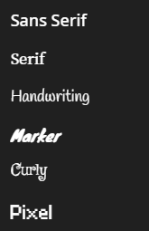
It’s all up to you. The one that fits your game the most. Sans serif looks quite ordinary and boring. I’d suggest Pixel but I might be biased through my retro gaming habits or maybe use the font that Clash of Clans use.

image
I use serif now, it looks more fit now

The orange with zero in it was a variable, i cant change the look of the variable. It’s permanent

I’m no good at coding, but I can give some advice on the design

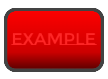
Make the text clearer, make the background consistent, if one button’s background is going to be dark, make the other dark (Well, you can still make it bright but maybe add an outline to the text so it can still be seen)
if one text is going to be in the middle, make the other in the middle aswell

And also the outline of the box should be consistent, if one is going to be black, make all of them black (Or maybe not I’m not sure about this one)

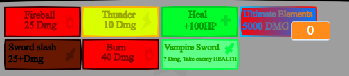
For additional stuff, you can add small symbols describing the attack, a small sword symbol, or a lightning bolt, anything!

wait what? I added a symbol of the attack in every single one

If one button background is going to be dark? (i seriously don’t understand lol, not that good at english)

image
this is the text color and outline for the fireball attack, i added a outline already

i might change that later on, im making a costume for the character right now

Ah, sorry, my screen is a bit dark right now


I just realized you might not have to do that, it’s probably fine to have different brightness in each buttons

image
What I mean is the text outline, not the text box
image


In short, make the text easy to see
image
Don’t do this (The text almost looks like the background)

1 Like

I’d suggest making those symbols abit more visible, I didn’t even notice them at first :sweat_smile:

1 Like

Use “if < weapon > then”
set < damage to > X
Change by - < damage to > + < defence >

Since you cant dodge it, not really any point in contact damage(not bullet hell game) although you could do it for quality.


Also suggest putting weapon hand as different sprite to body, easier animating body(dont do what i did with the animations do the next costume i just cant be bothered changing it, and it was easier to manage where it went wrong for me)

I draw some

1 Like